This section stores the various images I nabbed from the internet. Some are here because they're pretty; others because they're funny, or creative. All of them have various metadata attached such as artists, source, tags and descriptions detailing why they're here.
Note that while most graphics in the Shareables section can probably be taken for your own site without credit, some artists would like to be credited and linked to – it's noted in the description of images if that's the case.
I also want to say that it's a bit insane how much artistry and creativity you can cram into such tiny resolutions, and that I want to honor that with this section.
More info about this section
- The graphics here are not true one-to-one copies from the source:
- I automatically compress all of them to lower the file size and reduce bandwidth usage.
-
I rarely tweak some of the graphics
(e.g. fix graphical errors, or add transparency where it would make sense) in an attempt to objectively improve them. Tweaked graphics are tagged with and contain information about what I tweaked in it's description card. -
I try to include some basic metadata for every graphic; namely the artist that made it, the page I got the graphic from, tags
(see below) and a short description of what is noteworthy and what I like about it. -
Note that the names I give to buttons
(both the file names and the names displayed in the description card) come from me, and I rarely take some creative liberties to add jokes or other things I find funny or poetic into them – they're not official, is what I want to say. -
In case you want to look at these with greater detail, zoom in with your browser!
(Multiples of 100% work best – Anything else results in mixels!) - JavaScript only: You can filter graphics according to tags. Most tags here generally just describe the reason why a graphic is here.
- JavaScript only: Some graphics look better with a bright background! If you haven't noticed yet, there's a button on the bottom-right that allows toggling between light and dark mode!
Music for gallery perusal
- We Love Katamari – Meadowtronic (1 Hour Extension) – this popped in my head while writing descriptions for the buttons here, quite fitting considering how interesting the descriptions in that game were
(Video for context)
Sources for more graphics
These can serve as a good starting point if you want more. Another good way to hoover up new buttons is to visit other people's websites and see if they have sections where they too share graphics and links to other sites.
. Took the button from Zeus' Image Gallery.")

.")
.")
.")
Shareables
Graphics meant to be shared around and displayed on other sites and profiles
Buttons
Some people also seem to call these "Badges", which confuses me on two levels:
- Do buttons generally refer to small graphics used to link to each other?
- If these are called Badges for some people, what would the graphics in my "Badges" section be called for them
(or are they Badges too) ?
Website Buttons
-
 inaka a
Something about the glass-like text is lovely to look at.
-
 inaka c
Smooth looping and reminiscent of sitting on a train - I like it. The white border and minimal japanese(?) text at the bottom left is stylish as well. Looking at it also feels like it's like a window to some degree.
-
 REROLL
 -
 keerifox
 -
 Autumn's Grace
I like how it looks when hovered over in light mode.
-
 Shishka
 -
 No Follow
 -
 shibito
Looks a lot better in light mode
-
 ::CorBin's Portal::
 -
 matfloor
Yet another one that looks better with a bright background (since the matfloor text is transparent and the image is generally dark). I like the hover effect because of the transparent text (zoom in to better notice it)."
-
 Sukiyaki City
 -
 MystSaphyr
 -
 districts (Pippin)
Pippin is/was the name of the site's mascot, visible in this button"
-
 districts (Text)
 -
 Ametarium
The rounded borders are an interesting experiment.
-
 Tachyonic 1
 -
 Tachyonic 2
 -
 ZeusOfTheCrows / Ɀeus (Retro)
 -
 ZeusOfTheCrows / Ɀeus (Retro, but SVG)
 -
 ZeusOfTheCrows / Ɀeus (T17 Old)
 -
 ZeusOfTheCrows / Ɀeus (Scan)
 -
 ZeusOfTheCrows / Ɀeus (Terminal)
 -
 nine moonbeams
I like the unique border and colors of this button. More indirectly I also quite like the symbolic nature of the drawing of the moon present on the splash page. Looks better in dark mode.
-
 Gildedware
 -
 platinumtulip (Old)
 -
 platinumtulip (Diary)
 -
 Francis Gaarden's Ephemerium
 -
 static attic
 -
 Solaria's Webspace
I really like how it looks with .
-
 Super Mario Bros. X
I really like how it looks with the light theme.
-
 Slumber
 -
 CYBER ROT
 -
 melodicake
I like the idea of the strings extending from the border.
-
 Teh Leroy
 -
 Owlman
 -
 Moodle McDoodle
 -
 fizzsea (Old)
 -
 fizzsea (New)
 -
 a tiny space in space
 -
 asterizmz
I like the visual imagery of an undercliff since it reminded me of the game Rain World, but find the face in red annoying. Was it added because it's not their image and they wanted to put something of their own there? It just feels so out of place.
-
 Squidknees (Cute)
 -
 Squidknees (Spooky)
 -
 Synoicus
Pleasant colors, but I don't like the right border.
-
 Guymeats
 -
 No Devil Use
 -
 Split City
 -
 Sundered Space
The icon being cut off makes it feel like some sort of gigantic eldritch momument, impossibly precise and perfectly shaped. The stark white and black support that feeling.
-
 Cloverbell (Old)
Old version.
-
 ???
??? -
 Inkposting
 -
 Inkposting (Mono)
The 1-bit color palette as if it's drawn inside the Splatoon editor is a nice touch!
-
 Idelides – The Lazy Goddess
The theming of the site mascot as "the lazy godess" is cute.
-
 Ocean Waves
Uses the image for September from "Living Worlds".
-
 joppiesaus
I like the simplicity and the idea of using the bottom blue rectangle along with the text as an overlay.
-
 clouded
 -
 Drew's Special Blog
I love simplicity.
-
 limegreen
 -
 Yemaja
 -
 thunderswag
 -
 Bolt from the Blue
The lightning resembling a face is just generally a cool motif."
-
 The Magic Site
 -
 New Philadelphia
 -
 rini
riniThe main body of the violin fading in with the background and only being visible through the lighter and darker shades is a cool idea!
-
 tiny wanderer .gif
 -
 tiny wanderer .png
 -
 Cybernetic Dryad
 -
 Solar Pop Punk
 -
 Legacy / Necrophantasia
 -
 Park City
 -
 emptyhalls
 -
 Caitsith
Sadly, the cool Windows 7 design on the website makes my browser chug heavily.
-
 Time Travelling Birb
 -
 32-Bit Cafe
 -
 Internet Bee
The font and colors are nice.
-
 Papercuts
 -
 Contrast {{ hue's // GALLERY }}
 -
 Dog-House 3
 -
 Dog House
 -
 MYSTERYS?GNAL
The concept of the button is really cool. Made me want to figure out what letter each ? actually was the first time I saw it, and just generally seeing letters fade in and out in my peripheral vision just has something neat. I wonder how a really big monitor with a lot of those would feel like to observe.
-
 Aurpheus
 -
 Black Wings
 -
 Nokia64
 -
 kokoscript
 -
 wordhopper
 -
 Matytoonist <Web> Archive
 -
 Tanuki-Computing
 -
 18 Carat Affair
 -
 Tech Noir
 -
 Gold Currents点
 -
 VHS Midnight "Style"
 -
 Lost Angles
 -
 Dante Mars Ajeto
 -
 Internet Archive
 -
 Chapel of the Beast
 -
 Discord
 -
 Tumblr
 -
 Newgrounds
 -
 Romhack Plaza
 -
 Vinesauce
 -
 Lugaw
Lugaw -
 Alpha Centauri
 -
 Teshie F.
 -
 moondvsted
 -
 whiona
 -
 kirb
kirbTwo things: The scrolling background and the logo written with a sharpie and aberration effect
-
 10kph (purple)
 -
 10kph (pink)
Interestingly, downloading the png as is from neonaut with Firefox caused it to be somehow become a bit corrupted? Even stranger is that the corrupted image looks fine if you open the image directly by clicking on the link – it's only once you embed it in HTML or view it in Gwenview
(a Linux image viewer) when it reveals it's true nature:
Also strange is that this corruption is not present on the source site. I solved this conundrum by simply taking a screenshot and removing the background.
-
 des
des -
 somnolescent
The color scheme and layout is nice. The yellow looks nice alongside the purple and the low-contrast background image adds texture and makes the empty area not feel as empty.
-
 bitty bunny
 -
 Ectobeing
 -
 Infinite Shoals
 -
 Heaven's Arena
 -
 jeith!
 -
 Runaway to the Stars
 -
 Ballonlea
 -
 xiixxi
To me it feels like it's pronounced like "sixy". Overall just a cool name design with that air of crypticness.
-
 corru.observer
The name style with the bar-code + name under it in small print is nice.
-
 Nick64
Cool layout and fun visualizer that's pleasing to look at.
-
 Solinus' Website
 -
 NIGHTDRIFT
A nice distinct two-color palette, but the stylized name is quite hard to read if you don't know what it's trying to say beforehand.
-
 BeepFreeb
 -
 pont
pontThe smooth and slow animation. There's something I simply like about simple geometric patterns slowly moving in a direction. The whole website itself is filled with that as well and therefore quite stylish, but it's colors are somewhat bold and straining on the eyes.
-
 craw
crawThe colors really pop and fit alongside the crayon-on-a-dark-background style.
-
 Bagels
Simplistic, cel-shaded and rounded style that is just warm and nice on the eyes.
-
 lucario
The light from the border that reflects off the letters is a really nice effect.
-
 creature0354
There's something hypnotic about this one. I kind of like and don't like it at the same time.
-
 erysdren
A simple star background. I like pixelated starry skies.
-
 Textbook Cover Art
 -
 SysL
SysL -
 Punch the Moon
 -
 Labyrinth Zone
 -
 Wavebird
 -
 Leviathren (Eye)
 -
 Leviathren (Abyssal)
 -
 Sunpop
 -
 Occasionally Content
 -
 Michdev
 -
 Thin Liquid
 -
 Thin Liquid (Old)
 -
 Ribboncable (Logo)
I like the border and general color scheme even though it's very poor in contrast
-
 Ribboncable (Gaze)
 -
 Tiny Diorama
 -
 Gummi's Cloud (Noon)
 -
 Gummi's Cloud (Evening)
Text has a little bit too little contrast for my liking
-
 Gummi's Cloud (Night)
 -
 Neo Creatives Webring
Note that I am not part of it even if I included it here – the button is just pretty :>
-
 Neon Bandit Street
 -
 Shut Up Sergeant
The border is cool! (albeit a little funky on the left and right sides)
-
 Milkyway (Stelle)
The text animation is really smooth and satisfying!
-
 Pantson Color Club
 -
 icosahedronscape
(icosahedr.online) -
 Angel in my Head
 -
 Annie's Den
The real reason I added this graphic here is because the site this button links to has a really snazzy hover effect for buttons you hover over.
-
 Linwood
 -
 Linwood (Halloween)
I discovered that she made a page and button for halloween when visiting it 7 days after halloween was over. I generally liked the idea of having seasonal buttons as like a collectible for visitor's during a certain period.
-
 Maggy Hue
 -
 melankorin.net
 -
 ghostki.d
 -
 hellnet.work
 -
 Laggy Website
 -
 Saria's Train Station
Big fan of the sepia-esque color palette
-
 testtubesterone
 -
 Pudding's Cove
 -
 molecule31
In case you're too lazy to scan it – the QR code
is just a link to the website -
 Powered by Nekomment
 -
 Fruit Punch!
 -
 mn1ca
mn1ca -
 erisdump
 -
 wamwoowam
The homepage being a recreation of the Windows 10 tiled start menu is a fun touch and looks nice. It even seems to pull the latest content of various feeds, leading to a bit more clutter for the reward of more fun!
-
 kel weaver
 -
 Life can be a drag
I quickly doodled these buttons together because of two reasons:
- Firstly, because life can be (a) dream doesn't have a button and I wanted to link to it in the Links section.
- Secondly, I wanted to realize
(even if just crudely) the idea I had with the Train Carriage Button down below where there were a bunch of single train cars that you could then chain together to build your own train! A webring or pixel clique based around this idea would probably be cool.
-
 Life can be a passenger
I quickly doodled these buttons together because of two reasons:
- Firstly, because life can be (a) dream doesn't have a button and I wanted to link to it in the Links section.
- Secondly, I wanted to realize
(even if just crudely) the idea I had with the Train Carriage Button down below where there were a bunch of single train cars that you could then chain together to build your own train! A webring or pixel clique based around this idea would probably be cool.
-
 Life can be a conductor
I quickly doodled these buttons together because of two reasons:
- Firstly, because life can be (a) dream doesn't have a button and I wanted to link to it in the Links section.
- Secondly, I wanted to realize
(even if just crudely) the idea I had with the Train Carriage Button down below where there were a bunch of single train cars that you could then chain together to build your own train! A webring or pixel clique based around this idea would probably be cool.
-
 Tem Stand!!
 -
 Tem Roll!!
 -
 LandChad.net
 -
 // MYKO CALICO //
I mainly like the limited color palette, the dithering in the background as well as how it just moves slowly.
-
 THIS brain protected by Beefbrain Shield PRO
The site I found it one linked to groonklie.com. This is what I found in a comment inside the html code:
Snooping around as usual, I see? As of 10/22, this is my stand-in page for while I work on my actual website. You should expect something much more fleshed out in a month at most, but if it's 2023 by the time you're reading this, I probably got sick of this hobby and moved onto something else, sorry :/
groonklie's spirit trapped in an html comment, January 2026The actual contents on the button are a reference to Hypnospace Outlaw.
-
 freckleskies
I find both the general layout and the circle that has a simple mono-color animation in an otherwise static surroundings just really unique and interesting, for some odd reason.
-
 lazy bones
 -
 Ashton
 -
 hello room
 -
 VM's Numbers Station
 -
 Unicursal Maze Research
Misc.
-
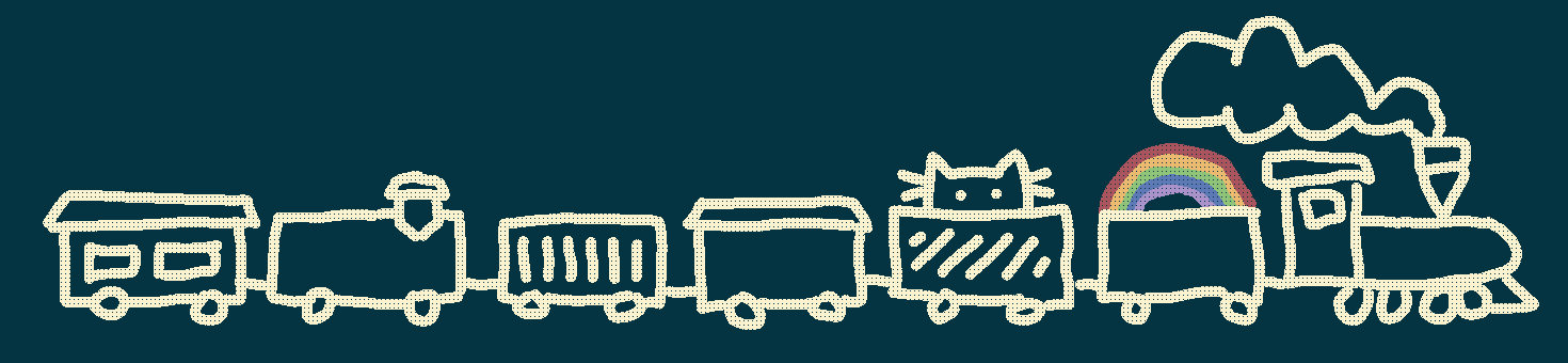
 Train Carriage
I like the idea of making multiple of these little train carriages and then being able to build your own train.
-
 Bells NOW!
I like the colors of the bell-sack on the left and the composition it has with the entire button. Click on this button to see other available variants.
-
 Rave NOW!
 -
 GeoCities
 -
 Parental Advisory 2
I like the layout of the two bars on top and bottom and the colors compliment it well. Click for more variations.
-
 All We Have Is Each Other
I like the colors and the fact that the text is still readable.
-
 Hollow Knight
 -
 Homestuck (Tweaked)
 -
 World Wide Web
 -
 CSS
CSSStill funny even though I don't find CSS that difficult.
-
 1080
1080 -
 2038
2038 -
 E-mail
Really satisfying animation!
-
 Mars
Mars -
 Protest
 -
 Scheisskopf
I don't know why, but the text on the button is german for "Shithead" - maybe because it just looks visually pleasing..?
-
 matrix
There is something nice about the simple color fading.
-
 Drawn with Aseprite
I don't know why smooth animations are as satisfying as they are, but god they're satisfying.
-
 Aseprite (Old)
 -
 Powered by bob
 -
 Colemak
A button that represents the Colemak keyboard layout, with the keys pressed on it spelling "Colemak"
(unsurprisingly) . A really neat idea for a button! -
 B-Sides
 -
 MusicBee
Pleasant colors. Really has something honey-like to it.
-
 MusicBee (free
 )
)Pleasant colors. Really has something honey-like to it.
-
 Yume Nikki
I like it's symplicity.
-
 Steam
Steam -
 Best Viewed (16Bit)
 -
 META TAG Analyzer
I like the border and how it's integrated with the left-side red area.
-
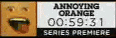 Annoying Orange – Series Premiere
240x80px
(which is why it looks a bit weird, being squeezed into 88x31) , 3,9 MB large, 600 frames, starting from 59:31 and ending with 49:32. Has weird random black corruptions on most frames, but despite that, I quite like the idea of a timer being incorporated in a button, even if it makes the file comparatively large. Maybe making a ''fake'' button with the same dimensions that is instead composed with html elements makes it more useful as JavaScript could then modify it. -
 Animal Crossing (Oranges)
When if first saw this button, it reminded me of the TV shows that would play in Animal Crossing games. It was exactly what this button was based on
(based on the file name) . -
 Animal Crossing (Peaches)
Same as the oranges. Stylish peaches.
-
 Long Live MSPaint
 -
 Sprunk
 -
 VHS
VHS -
 Citizen of Terra
Depicts the flag of Earth. Has a cool handwriting animation!
-
 Bad Apple
 -
 Cassette
 -
 Clouds
 -
 Plaid
Plaid -
 Rainbow
 -
 ???
???Seems to be the button of a japanese website maybe..?
-
 Netscape No!
 -
 Missing No!
 -
 APNG Assembler
 -
 Chromium – Same shit, different arsehole
 -
 Mobile friendly
 -
 The Truth is Out There
 -
 Irgend...
'The text is german and translates to: "Somehow, Somewhere, Somewhen"'
-
 World Machine
 -
 Adventure Line
 -
 Star
StarSadly a lossy jpg
-
 Cinnamon
 -
 Construction (14 Segment)
It's through this button I learned of 14-segment digital displays and how useful they are! If you pause and look at the background, you can see the 14 areas where lights can be either on or off.
The border is also a nice touch, even though it sadly doesn't fit with the animation cycle of the text scrolling by, causing it to pause for one frame to properly sync up.
-
 Construction (Dot Matrix)
I like these sort of text displays that have big dots on them.
-
 Anarchy Now!
 -
 Decker Now!
It's nice to see a button capture the visuals of a piece of software so authentically.
-
 Not for Children
A visibly compressed jpg, sadly <(p>
-
 Don't feed AI
 -
 Mystery Site
 -
 YouTube
 -
 Dream
Dream -
 Pale Moon
 -
 Darksleep
 -
 Winamp
 -
 Reddit
 -
 Linux now!
 -
 Made in Blender
 -
 Arowave
 -
 No Smoking
 -
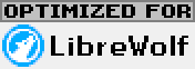 Optimized for...
 -
 Netscape Now! (3D)
The general idea of 3D buttons is pretty interesting.
-
 Halftone
jpg 😔
-
 HypnOS
 -
 Sburb
Sburb -
 Escape Zone
I just found this button in my buttons folder, completely unused anywhere on the website. As such, I don't know where I got it from, or if it belongs to a personal website or such.
-
 Krita
Krita -
 view-img-source: Now!
The color's are just nice
-
 #008080
 -
 Button Lover
 -
 Lonely
 -
 masakoto420
 -
 Peace
Peace -
 DuckDuckGo
NeoCities
A modest collection of Neocities buttons. Since NeoCities themselves didn't release an official 88x31 button, several people have made their own. This is/was an attempt to collect them into a single page that I've given up on because it became tedious to search for the source of every button.
The only two official assets that NeoCities made for sharing are brand assets on the NeoCities Press page.
-
 Passion
 -
 Hosted on NeoCities
 -
 NeoCities.org (Starfall)
 -
 NeoCities.org (Jumpscare)
 -
 Hosted by NeoCities.org
 -
 The Web is Yours (90s)
An alternative to the popular but very 90s style Neocities button seen all over this site. Meant to blend in with more modern sites. Also the other one people use isn't exactly 88x31? Weird.
-
 Free Homepages!!
This one's an edit of an old GeoCities button.
-
 Editor Idiota
Raise your hand if you, too, edit your site live directly in the Neocities code editor like a fearless fool.
-
 Hosted on: NeoCities
According to Bytemoth, this was made by techramancer, but I couldn't find it on the site
(it wasn't down the time I wrote this, but now it is – oh well...) nor any claim that they made it. However, I also found another NeoCities button on her page that used the same font for NeoCities and is also written "Hosted by NeoCities", although here they also didn't mention who made it. -
 Hosted on NeoCities (Window)
It might be that this image was made by techramancer since bytemoth says that the button to the left of this one is also made by techramancer and both use the same font for NeoCities, the same image of Penelope the Cat and the same general text ("Hosted on NeoCities").
-
 Penelope
 -
 Windows
 -
 The Web is Yours (Futuristic)
 -
 NeoCities (Space)
 -
 Hosted on NeoCities (Gradient)
 -
 NeoCities: The web is still yours
 -
 NeoCities: The web is still still yours
 -
 NeoCities (MonoTone)
 -
 Made in NeoCities Editor
 -
 NeoCities.org
The OG graphic that inspired every NeoCities button after this one. That's a bit remarkable!
-
 NeoCities Spin
That 3D rotation effect is really cool! It's also just a good showcase that there are many edits of the original button just with different color schemes
(and thus not really worth listing) . -
 NeoCities with Pleasant Colors
 -
 NeoCities (Neon)
Originally, this is displayed on a pure-black background.
-
 Blinking NeoCities
 -
 Blinking NeoCities (Clean)
Special
Those with non-standard sizes or special functionality
-
 for kirbysdreamsite. Taken from kirbysdreamsite. It's adorable :>.")
-
 Emma Essex
Source lost. The website this belongs to might've rebranded to heckscaper.com?
(it's the first thing that came up when I searched "emma essex website" on DuckDuckGo) Here in special due to it's un-standardized size: 100x35
-
Kallistero'sProject Cy
-
 Affection
Here due to it's un-standardized size: 88x32
Stamps
"A style of graphic that's most popular on deviantart, an art website that was popular in the early 2000s. Usually around 99x56px."newlambda's graphics page
I also found a neat article that details how stamps came to be!
Note: Besides 99x56 there are also a few 100x56
-
 Blue Heart
 -
 Blue Heart
 -
 CSS"
CSS" -
 Lava LampI'm not sure if it's supposed to be animated or not. I still like the colors.
 -
 Piracy RollI like the idea of 2-color images.
 -
 DVD
DVD -
 Gameboy Splash ScreenI like the smoothly animated text!
 -
 Gameboy Splash Screen (Halved speed)I still like the smoothly animated text!
 -
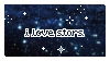 I love starsI like the stars (and find the text unreadable).
 -
 Comics are an art form
I love the visual idea of having the stamp's border also seamlessly be the borders between the gray squares.
DeviantArt descriptionOkay okay okay. So y'all love the stamp. I should be thankful for that at least.
It just feels weird that most things in my gallery have taken over 10 hours and lots of blood sweat and tears to produce, and this .... THING took 5 minutes to tack together and toss out, mostly as an afterthought. And it's by far the most popular item I've ever created.
I feel like an author who's written dozens of novellas, yet it is one trivial limerick, scribbled on the back of a soiled cocktail napkin, that everyone loves.
I just wish there was a way to turn off +fav notifications for individual items, because this is all I see anyone +faving anymore.
-
 JellyI find the color's really pretty! It also reminds me of how the crystal heart in the first stamp here would look like if it's shattered.
 -
 Shooting Star
 -
 Nintendo DS
 -
 Stardew ValleyEven though it would break the stamp style, I think it would look a lot better if the stamp border would be removed and you can see the boards in the background fully like in the title screen in-game.
 -
 Portal 2
 -
 Proud ThiefI like the color scheme and simple layout and design. It also reminds me of a dotted outline which would be present on letters or something that indicates where actual stamps would go on.
 -
 rain
rain -
 I love starry skiesI like the color scheme (and starry skies).
 -
 Your Own WebsiteStyled like a Windows 7 window (although other windows versions might've also had that design).
 -
 Vaporwave
 -
 Water
Water -
 Tablet User
 -
 NO SIGNAL
 -
 Fields of Stars
 -
 Home
Home -
 Balls
Balls -
 Cat and the Cursor
 -
 Nightowl
I love the vibes this stamp gives me - it's reminiscent of those I got when I first played "Over the City" from the Strawberry Jam Collab and heard "Urban Solitude" from strawberry jams vol. 1.
-
 InspirationThis is mostly here because I never made the mental connection that envy and inspiration are essentially about the same thing
(someone else being better than me) and because it might help me overcome my envy when it strikes again someday in the future. -
 Scrolling Cats
 -
 Earthbound
 -
 Bad AppleYes, it really is the majority of Bad Apple. There are 3097 frames and the file size is around 1.1MB. Sadly it doesn't loop perfectly because it skips a bit of the beginning. The video also seems to be cropped to fit the stamp and sped up to reduce the file size.
 -
 IMSCAREDBased off the game IMSCARED.",
 -
 IMSCARED (w/ title)Based off the game IMSCARED
(This one specifically on it's Steam page banner) . There's something about the layout of the text at the bottom right as well as the font and the line above the text that I like.", -
 Phone BoothIt's mostly here because of the gradient border. The monster both looks like he's headbanging and reminds me of a cat paw swatting something.
 -
 Pantone – Black
 -
 Pantone – Peach Quartz
 -
 Pantone – Greenery
 -
 Pantone – Holographic
 -
 Pantone – Stardust
 -
 Signal
 -
 RAMDARAMBased on an OC from the YouTuber Ramdaram.
 -
 ShockI love the dissonance between the shocked women and the suave innuendo guy.
 -
 Thinger Strangs
 -
 AlulaDepicts Alula from the game OneShot, a very adorable and enthusiastic child.
 -
 Believe
 -
 JijiIt's so smooth!
 -
 JegbertHypnotic,
 -
 Rillakuma
 -
 dog <3The dog included is cute, the overlay of blue interesting and the message's position visually pleasant
 -
 Red LightningThe fact that it's quick and that there's a smaller, barely visible burst of lightning before the main one makes it feels satisfying
(the word tactile comes to my mind somehow) . The fact it also starts and ends in pure darkness, causing a perfect loop, makes it even better. -
 Turret Love
 -
 Upgrade
 -
 Biota
Biota -
 Nokia (Boot)
 -
 Invaders
 -
 Kirbs
Kirbs -
 RUN CMD
 -
 Thomas
 -
 Snake
Snake -
 Nokia (Menu)
 -
 SCP
SCP -
 American Megatrends
 -
 Ambiance
 -
 HTML
HTML -
 I support Glass Effects
 -
 Duck Song
 -
 Waste
Waste -
 Water
Water -
 Water 2
 -
 Water 3
 -
 Water 4
 -
 Vib Ribbon
 -
 In the End
 -
 Dr. Hax
 New Challenger
 nya.gif
 Multi Kirbs
 Wheelslip
 Dapperblook
 HillI love the semi-trasparent glass-like stamp border! I've seen in in a few different stamps and wonder if there's a template somewhere out there...
 Metal SonicThe way it's just two images it switches between and the tempo between those frames reminds me of the TV shows in the Animal Crossing games. It also wasn't until I placed Sonic Mania recently that I recognized that these are frames from an actual animation in the game – quite a surprise to see it in-game!
 Backrooms
 Rickroll
 🖕
🖕 Sharp Edges
 I'm going to poop on you
DeviantArt descriptionI hate pigeons, I think they aim their poop at me :c To use this stamp, just paste :thumb47381208: into your journal. Have fun!
Photo from stockXchange, a free stock image site.
 ROFLcopter
DeviantArt descriptionThis is my version of a ROFLcopter.
 Captcha
God I hate captchas ;_;
DeviantArt description Wonderland
DeviantArt descriptionI've always liked watching the end credit of Tim Burton's Alice in Wonderland because of the great song and mushrooms. :D
Feel free to use this on your profile, just copy and paste the :thumbcode:.
I hope you enjoy! :aww: Let me know what you think.:tea:
 Glasses
DeviantArt description...and yes, mine are always that dirty. Well, okay, not THAT dirty - I exaggerated it. But pretty smudgy.
Also, my vision is way worse than this, but I wanted the text to remain visible without the glasses so... they're only mildly long/short-sighted.
EDIT AHOY: Thank you to RJDaae and ginkgografix for the DD! :la: You both gets LLAMAS!
Also thanks to everyone who liked (or still likes :lol:) the stamp! I probably won't reply to all of you but I am still very grateful! :DSECOND EDIT
Okay.
IT'S OKAY.
I get it. I GET IT.
Some of you wear glasses. (It's probably why you're looking at this.)
Some of you have somewhat bad eyesight, but it seems most of you have shitty eyesight. And think it is something to brag about, or at least that it is imperative you tell me.
Now that this has been well established, could the comments actually start meaning something, please?Final EDIT:
Comments are now disabled to stop people bragging about the medical numbers of their 20/100 eyesight and how badly they look after their glasses....the stamp has 1034 comments :D
 NO NO NOPE NONO
DeviantArt description>when someone asks you for free art.
(only the parts that weren't advertising)  Tetris
 Seal Stoop
 Palm trees
 I love snow
 Neon Purple Aesthetic 10
 Night Drive
A good mood.
 Tetris Worm
Honeycomb Stamps
An experimental stamp format made by mooena
-
 3D CG
3D CG -
 Krita
Krita -
 Gel
Gel -
 Teal
Teal -
 Libra
Libra -
 18+
18+ -
 No NSFW
 -
 Music
Music -
 Tom Nook
There's just something about his dead-pan stare that I find funny :D
As if he's judging you as you scroll by.
-
 Tamagotchi
 -
 Water
Water -
 Corn
Corn -
 Moon (New)
 -
 Moon (Waxing Crescent)
 -
 Moon (First Quarter)
 -
 Moon (First Quarter)
 -
 Moon (Full)
 -
 Moon (Waning Gibbous)
 -
 Moon (Third Quarter)
 -
 Moon (Waning Crescent)
 -
Moon (New New)
(Included again for stamp symmetry when on desktop!)
Blinkies
150x20px graphics, often with blinking borders and more space for text "Small, flashing gif banners that were popular on cites like geocities. Most of these are from old geocities sites, but some have been made recently in the same style. Most banner-type blinkies are 150x20px, but "blinkie" can describe many small flashing graphics of different sizes."
newlamba's graphics pageI personally don't like blinkies that blink too much.
-
 iPod
iPod -
 Night Person
 -
 Camp Fire
 -
 Dream FirePleasant colors
 -
 ItalicNeat wordplay
 -
 Marquee
 -
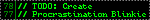 ToDoAbsolute minimum viable effort to count as a blinkie, and I like the typography of it. The fact that 77 comes after 78 confuses me.
 -
 gamer
gamer -
 Reality
 -
 do not the catI love cats and I love comedically broken english.
 -
 Control
 -
 Blink
Blink -
 Caution
 -
 Coffee
 -
 Crayon (Sunset Orange)Click for lotsa crayons!
 -
 Worm (Pink and White)Click for lotsa worms!!
 -
 Rainbow ASCII
 -
 https://Blinkie.World/
 -
 MSPaint
 -
 DiscsReminds me of the rolling apple TV show in the Animal Crossing games
 -
 Heartbeat
 -
 I love Night
 -
 kiss this!
 -
 Subliminal
 -
 Off my Planet
 -
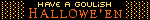 Hallowe'en
 -
 Time
Time -
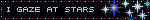 Stars
Stars -
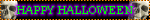 Happy Halloween
 -
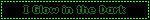 Glow
Glow -
 HTMLI quite like the idea here that the "blinking" borders are only on the top and bottom and move in the same direction, similar to a stream of data.
 -
 get silly!Satisfying wavy text.
 -
 Nuggies!
 -
 Crime TimeThe dashed border and wobbly text is pretty nice!
 -
 Hot Stuff!
 -
 Talking Heads
 -
 Thoughts"you are not your intrustive thoughts" – I just found it a nice reminder when I saw this the first time.
 -
 Close the window!It just gets it's point across incredibly well in a blunt
(and a somewhat passive-aggressive) manner. -
 hazardousA good execution on the idea of making blinkies a marquee for longer text
(as in, the text scrolls a good amount per frame to be easily readable to me) . -
 Cow!I just like the cow pixel art!
 -
 Source of Life
 -
 Happy New YearI think the confetti is pretty. Also, these kinds of graphics celebrating times like christmas, halloween, new years feel homely to me.
 -
 Night Vale
 -
 Piano
Piano -
 Wow! I'm 3D! / Momi I'w 3Di
 -
 Seal of Approval
 -
 Mind Control
 -
 My Moon...
 -
 Rainbow BOOBS!!!
I like the Rainbow gradient effect where the rainbow is static and only the text shifts.
It might also surprise you that I too am a fan of boobs.
Special
Those with non-standard sizes-
 Error
Error -
 Right Clicking
Badges
80x15px graphics often used to display info tidbits or link to things-
 Open 24 Hours
 -
 Trans RightsI like the faded colors and the way the pink border merges with the flag on the left
 -
 Tea Powered
 -
 Live
Live -
 Mario Bros
 -
 Secure
 -
 Search
 -
 Terra
Terra -
 Terra (Aqua)
 -
 PC Compatible
 -
 No Popups
 -
 Save as...
 -
 Atom
Atom -
 GMail
GMail -
 Creative CommonsNote that I display this here purely because I like how it looks. It doesn't say anything about my websites copyright status (as I don't know anything about it and choosing something would require research).
 -
 Neon Dream
A badge that's just a previous Animal Crossing artwork of mine adapted to "fit" onto a badge, along with random words that I felt kinda fit. When I made this, I wasn't really aware of the actual purpose of badges
(that they're normally supposed to provide quick tid bits of info about something) and just thought they're another art medium with a funny resolution – however, I still accidentally followed the convention of the icon being left and the text being right :DLooking back on it, it could kinda fit symbolizing that a person likes the style of neon lights...
-
 bash
bash -
 Pikachu
 -
 Heart Space
 -
 Brunette
Other
Miscellanea
Square
Favicons
The icons of websitesCloverbell's Materials Page
A lot of graphics that have that waft of early web graphics that I likeThe One and OnlyTwo Dividers

 Links page")
. 16x16px variant.")


.")


