Midnight Horrors is a Roblox game with many different maps, and I got the idea of mapping out some maps as pixel art to both help me orient myself on some of the more difficult maps and to hone my coloring skills as I'd use a different color scheme / style for every map.
I don't really play that game anymore, but it's still a neat, fun and useful side activity that I'd like to pick up again when I play the sequel called Darkest Hours
Other things of note
- Most maps use some colors and symbols to symbolize certain elements:
- White dots or stars usually represent player spawn points.
- Red dots or circles usually represent the killer spawn point.
-
 Some maps link to the .ase file I used to make the map
 (Hosted via Catbox) if there are some additional layers that didn't make it in the final version. If that's the case, you'll see the image to the right while hovering over them. -
If Catbox ceases to exist
(and because I like keeping every file in one place) , visit this page, download one of the text files on there and open it in Aseprite.
The maps
(Mostly) Finished maps
-
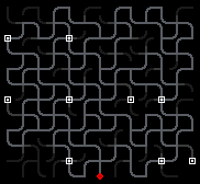 Where?
The first real challenge to map out. Players spawn facing the west side of the image, and by memorizing the path configuration of each spawn you could theorically actually orient yourself within the map. Paths that are darkened out lead to dead ends so you can quickly evaluate which paths to run down while running from a killer. I also like the style.
Fun Fact: While mapping out this map, I once thought that the map was randomly generated each time it was picked, making me panic as I realized that my efforts might be in vain, but in the end the map is still confusing even without being randomly generated.
-
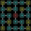 Directional Discomfort
A simple map, but I like how it turned out. Yellow plates are the ones players spawn at, while the red one is the killer spawn. Only paths that are walkable are really visible, and surrounding decoration has been toned down to make the arrows more visible.
After looking at it now, I think the arrow on the panel to the left of the red one is pointing in a wrong direction. Maybe I confused it with the one to the right of the red panel?
-
 Murdon
A really simple map I probably made because it was simple to make and I was on it while I got this whole idea to begin with. The most interesting idea here is using brighter colors to denote higher places.
-
 Restaurant
This was a particular challenge as there was no grid-like structure that would make mapping easy; every hallway has it's own width and length independent of any other. Despite this, I still like how it came out.
-
 Axis
AxisA really large map I found fit because of the grid-like texture of the ground which could easily be translated to pixels. I also got to play around with custom brushes in Aseprite for a bit while making this. And I also think that the colors fit the map in-game well.
-
 Backrooms
One of the first ones I made due to the simple grid structure of it. I like the color scheme although it's probably a bit hard to read? Basically, all blocks in the grid are connected except for the ones with that darker wall inbetween. The subdued crosses are parts of the map I haven't mapped out due to the rounds ending too quickly.
-
 Cybergrind Pit
An image I'm not too proud of. It looks unappealing and just generally was not too fun to work on. It also isn't too legible what tiles are stairs and what aren't.
While mapping it out I didn't even know it, but after having played ULTRAKILL like 1-2 years later I realized that this is one of the potential layouts for the Cybergrind Pit, a gamemode in ULTRAKILL, so... neat reference!
Unfinished Maps
-
 Daydream
More of a style test than a real map, but it's a style that I really like. The dark colors complemented by the brighter and less satured colors are nice - I especially like the idea of sketching around the map with that green color that's supposed to imitate those star stickers that would glow slightly in the dark that are commonly seen in kids room. One use for that is for that hilltop drawing at the corner, denoting a higher up place.
-
 Corridors
A test for making a stylish looking, part SCP and part bunker inspired dark, grunge-ish bunker, maybe with realistic shading and texturing. I did not stick with it for long as I was getting a bit frustrated even finding some base colors that look nice and fit the vague, ungraspable visual idea I have for this map. As you can see from the layout, there isn't much use for a map like that, so it really is just style over substance with this.