A collection of every graphic I made for this website. A lot of these actually have additional thoughts that are visible while mousing over them.
General Art
Buttons to link to my site with
- Made for other people to display on their websites in their links section.
- The hardest part for me was making the animated pancake ring
(or rather motivating myself to figure out how I should do it and then actually doing it) - the globe and pancake looked fine/good to me after a bit of tweaking. - The trick I used for the pancake belt was hand-animating 6-8 variations of a singular pancake flying around from start to end and then copy and pasting those variations at different times - it works well enough and wasn't as daunting and dreadful to do as my emotions made it feel, and I think actually making it only took a few hours
(barring the time wasted by emotions) . - Through making the second buttons and the dark mode version for the first button I finally learnt how to move more than one layer at a time and how to replace the color of more than one layer and frame in Aseprite.
-


My original set of buttons I made back when I still had my old website. At the time, the website still used a light-mode theme and therefore the old buttons had a white background as well. Since the new site is now in dark mode, I later made a corresponding dark-mode version
(and touched the light-mode buttons up a bit) when I made the second row of buttons below this one.
-


I made this row of buttons a bit after the new website with the original motivation being that it slightly annoyed me that there was no button with the full name of the website written on it. I originally made the dark mode version since the site is now in dark mode, but the light-mode one came immediately after that
(after struggling with the outline and readability of the letters for a bit) .Personally, I like this version better since it feels more visually cohesive with the text being on the right 2/3rds and the icon on the left 1/3rd, compared to the first version where the lettering is interrupted by the icon.
Informational
-

"That's some lit writing 🔥🔥"
-

I am lucky that I made this website on october since some letters are impossible / would look ugly in that digital digit style.
Section-specific Art
Links
Custom Buttons
-

-

-

Clearly the most elaborate piece of this page. 
-

One of my favorites! -

-

-

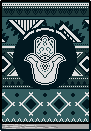
I found the idea cute to make an icon using the art tool it links to.
Edits

Music Library


- These two were derived from an unused graphic
(an image with an heart and star together) , scaling both down and fixing them up. - I made these for the Music Library as a visual way to mark songs I've liked and loved with a star and heart respectively.
Unused Assets
Hovercard Subpage Indicators
-

- An icon I made for the "Links"-section. This icon is visible on those buttons that have an associated page in the "Notes on..."-subsection.
- I find that the icon looks best when it's placed where it would normally be, at the top right of a hovercard
(as you can see now!) . Something about the composition is just nice. - The art style reminds me of The Binding of Isaac: Rebirth's art style with a two pixel wide outline and two crude frames it switches between. I like the look of it.
-

A variation of the previous graphic made for the Music Library section
-

A variation of the previous graphic made for .ase files, generally present in the Pixel Art section.
Links
-

I removed HealthyGamerGG from the Links page since it has grown into a direction that feels like it deviated to the reason why I've grown to like the channel and don't really watch the channel actively anymore to tell how it's changed.
It's kind of a shame since this pixel art is one of my favorite icons I drew for the Links section, with the simplistic icon and the hover effect and all.
Meta-section links
-

I don't know if I'll ever add an RSS-Feed simply because of the fact that I already struggle with writing regular update notes whenever I somewhat significantly update this website. If you want an automatic update feed to know whenever I updated, I'd suggest following me on NeoCities. There even is an automatically generated RSS-Feed under the share option if you're so inclined. -

-

-

-

-

A riff on the phrase "mobile-friendly" that I found funny when it popped into my mind, but after reading about other people's writings and thinking a tiny bit about it, I feel kind of bad including it now since it kind of doesn't apply
(I do make an effort to make some/most parts do seem mostly accessible for mobile, with the only problem being the whole hovercard thing) and since it just feels too brash/"rude" in a way.That word play is still funny to me, though.
..."Do not panic if mobile device barks in retaliation!"
Me Sketchbook
Pixel Art of the cover of a sketchbook I once bought when I was like 16. This was planned to be used for a page in the art section where I digitize all pages from this sketchbook and upload them, with each page having a bit of commentary/thoughts about them. I've got the images scanned, but am too lazy too make the styling for that page, so now this pixel art sits here.
I also made a little satisfying shaking animation whenever you hover over the book.
Misc

An unsused rating for the Music Library that would indicate songs I liked more than those I loved. It's reserved for the few songs that impacted my life in a way most songs never has, but I never really encountered such songs so this graphic rests here instead.
Another problem with this is that it has the color of the star icon and is thus really hard to distinguish in a column of star-rated songs.


A variation of the previous graphic made for .ase files. The difference with the used version is by the fact that this doesn't have a fold in the paper to the top right.